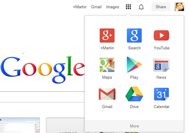
Are you bored seeing the same-old black menu bar that Google displays on top of the page? If yes, then get ready for an update on the upcoming Google rollout for new navigation menu replacing the old black navigation menu bar. The new menu is lighter in design and much identical to chrome app looks. It is expected to reach to all Google users over the next few days. However, this is not the first time that Google is changing the navigation menu looks; a similar effort has been made earlier in November 2011, where Google tried to implement a new menu which was called as Google menu; however, due to lack of positive feedback, they had to remove it and had to place back Google black bar.
Nevertheless, the new navigation menu after being tested for almost half a year, Google has finally decided to implement the new navigation menu by completely removing the old black bar from Google.
Google new navigation menu is already being rolled out for few users, and one of the users has posted a picture of new Google’s navigation bar, which has been confirmed by one of the Google’s Employee, Justine Rivero in Google+ that said,
“Glad you noticed! We’ll be rolling out this new feature in the next few weeks.
…stay tuned!!”
The new look offer a clean and elegant styled navigation menu that offers all Google’s product under one grid instead of hyperlinks on top black bar. Besides of Google home page, the new navigation menu would also appears on other Google product like YouTube. According to the Google Plus Daily reports, it is expected to support other products like Google+, Gmail, Blogger, and other products. However, nothing has been confirmed yet by Google.
What do you think about Google new navigation menu?


This sucks.
I want my navigation bar back.