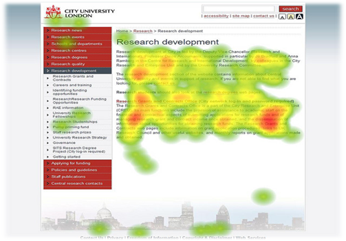
Multivariate testing, often called A/B testing, seems to have caught on with many SEO strategists all over the world. The big idea behind this testing is that you can measure multiple website elements simultaneously to see how they perform with your website’s core users. In fact, A/B testing is becoming a necessity in the web design and SEO communities. Web users are less predictable than they have ever been, and that means it is hard to nail down their website element preferences on a day to day basis. Many web designers and web developers are finding that even the most seemingly insignificant changes are producing the biggest results.
Elements You Should Test
Just because you can test every element of your website doesn’t mean that you should. Since the main focus of multivariate testing is to increase conversions or sales, you should focus on website elements that are calls to action. This means that you should test any element that would potentially lead a website user to convert or buy something. This narrows the scope of elements you should test significantly.
Headings
Studies say that you have about three seconds to convince a web reader to keep on reading. The first thing a user will read on a landing page is the heading. The heading, in large part, will determine whether or not your website’s users will continue reading or simply exit the page. If your sales funnel relies heavily on text content, this is among the first elements you should test.
Images
Your website’s users are naturally drawn to the images on your page. This is especially true if your website’s images are exciting to look at. But these images can easily affect how users interact with your call to action. The right images and image placement can make or break your conversion rate.
Brand Awareness
One of the most important elements to be tested is your brand’s popularity. It’s common sense that the popularity or unpopularity of your website can positively or negatively affect conversion rates. But you can actually hurt your conversion rates if your website’s users are overwhelmed with brand awareness throughout the page. The only way to find out for sure is to test your website to see how users respond to your brand.
Text
While few users will actually read all of the text surrounding your call to action, they are more likely to respond to your call to action if the text surrounding it is relevant and useful. Creating a few blocks of text surrounding your call to action will go a long way to improve conversions.
Buttons
Buttons may seem like they don’t need much testing, but if your call to action is in the form of a button this must not be overlooked. In a nutshell, buttons are often the easiest way to complete a call to action. In fact, the effectiveness of your website’s buttons will be the driving force of your site’s conversions. You should start by asking some questions about your buttons. Do they actually look like buttons? Are the buttons intuitive, and easily clickable? Design multiple button combinations, and test them against each other for the best results on your landing page.
Author Bio: Tech writer EJ Parfitt has been writing for a short time now and has already picked up steam with several tech websites and local news sites. During his free time, you’re sure to catch him competing in local chess tournaments in downtown Fort Lauderdale FL.


